Pyth Publishers Metrics
Pyth Publishers Metrics is a feature that provides insights that will empower developers, publishers, and delegators by providing the historical performance of the network's data sources. This powerful tool reflects a commitment to transparency and delivering timely, accurate, and valuable first-party data for everyone.
The Insights Hub has been retired
The interactive Publisher Metrics pages were hosted on the Insights Hub
(insights.pyth.network), which has been retired. Its URLs now redirect to
Pyth Terminal, which lists every price feed
but does not expose per-publisher metrics. The sections below describe how
each metric is defined.
Price Series
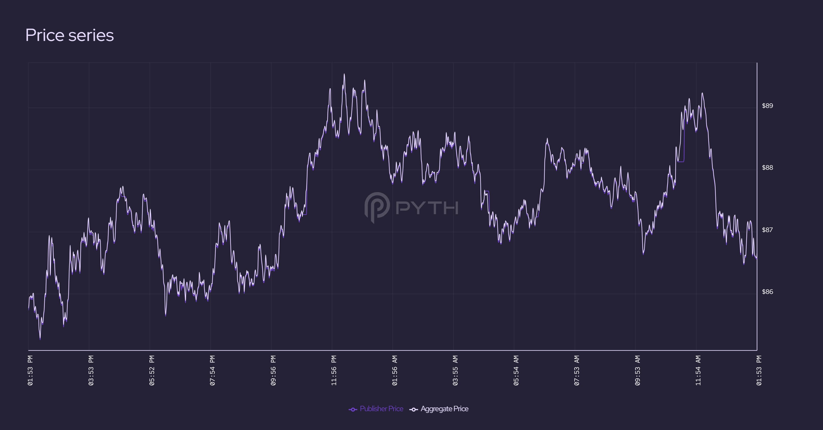
The price graph shows how a publisher's price compares to the aggregate price, illustrating how closely the two prices track each other, and whether there were any periods where the publisher deviated significantly from the rest of the market.
Uptime
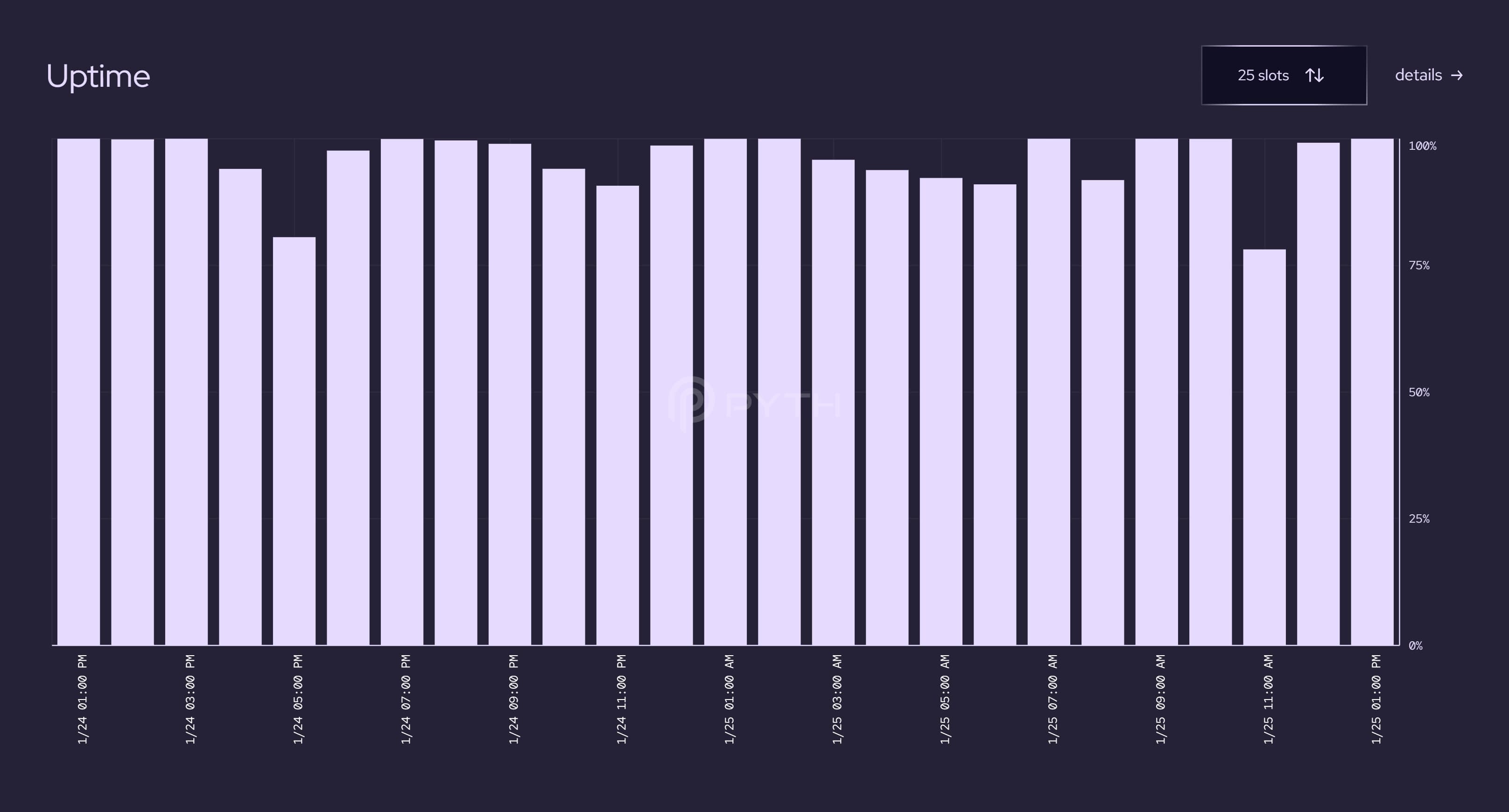
The uptime graph shows when the publisher was actively contributing prices. The x-axis subdivides the time interval into bins, and the y-axis is the % of slots in that bin where the publisher's price was recent enough to be included in the aggregate. This graph lets you determine the regularity and reliability of a publisher.
Quality
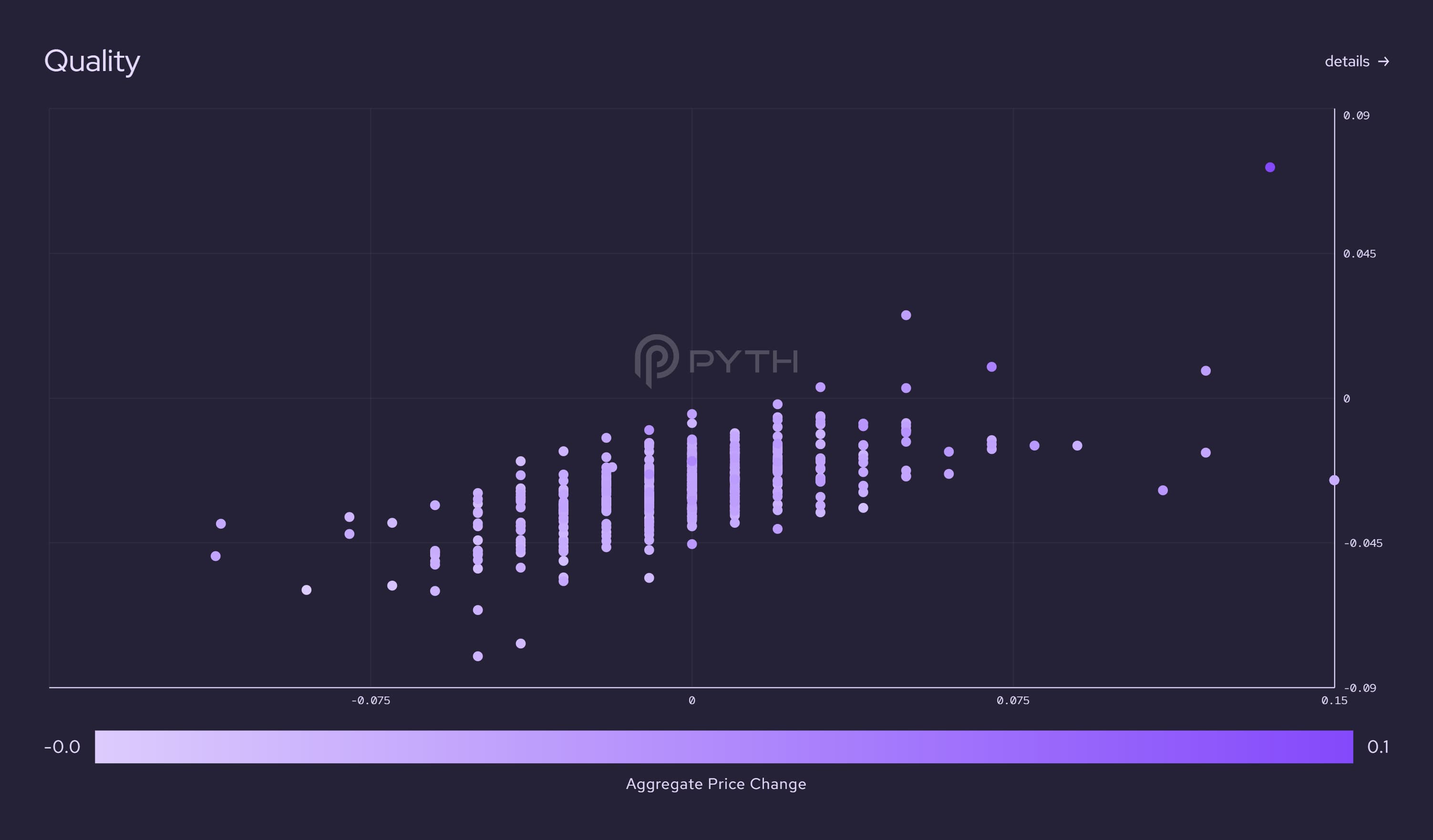
The quality graph shows the dataset used in the regression model for computing the quality score described in section 4.1.1 of the whitepaper. The quality score measures how well a publisher's price series predicts future changes in the aggregate price. A smooth color gradient (from blue on the bottom left to pink on the top right) indicates a high-quality score.
Calibration
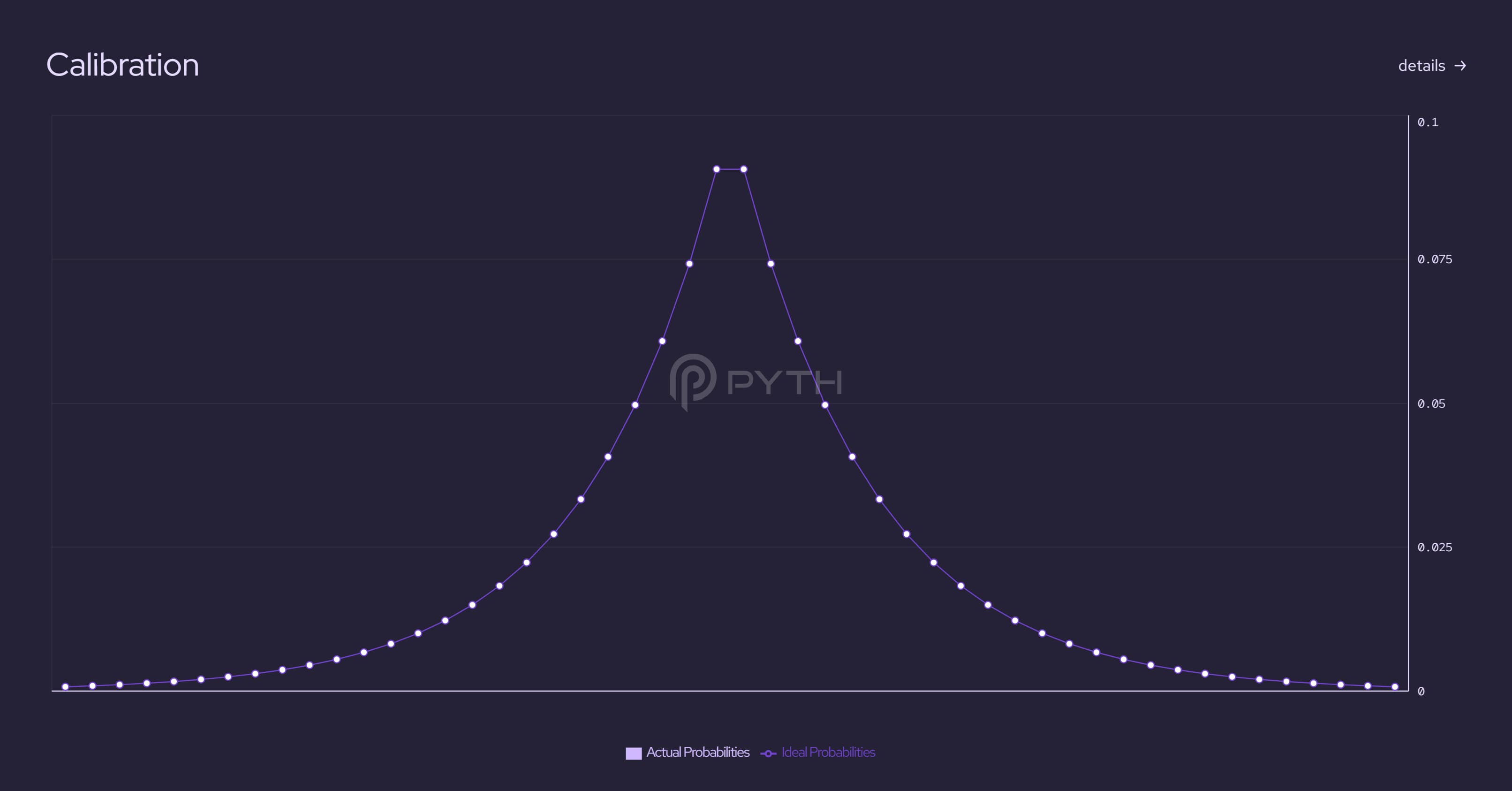
The calibration graph shows how closely the publisher's prices and confidences match the expected Laplace distribution. The closer the fit between the two distributions, the higher the calibration score (described in section 4.1.2 of the whitepaper). In other words, a perfect publisher should produce a uniform histogram. As a reminder, the calibration score does not reward publishers for producing tighter confidence intervals; rather, the score captures whether the reported confidence interval corresponds to the publisher's "true" confidence.
For more details on the Pyth Publishers Metrics, please visit this blog post.